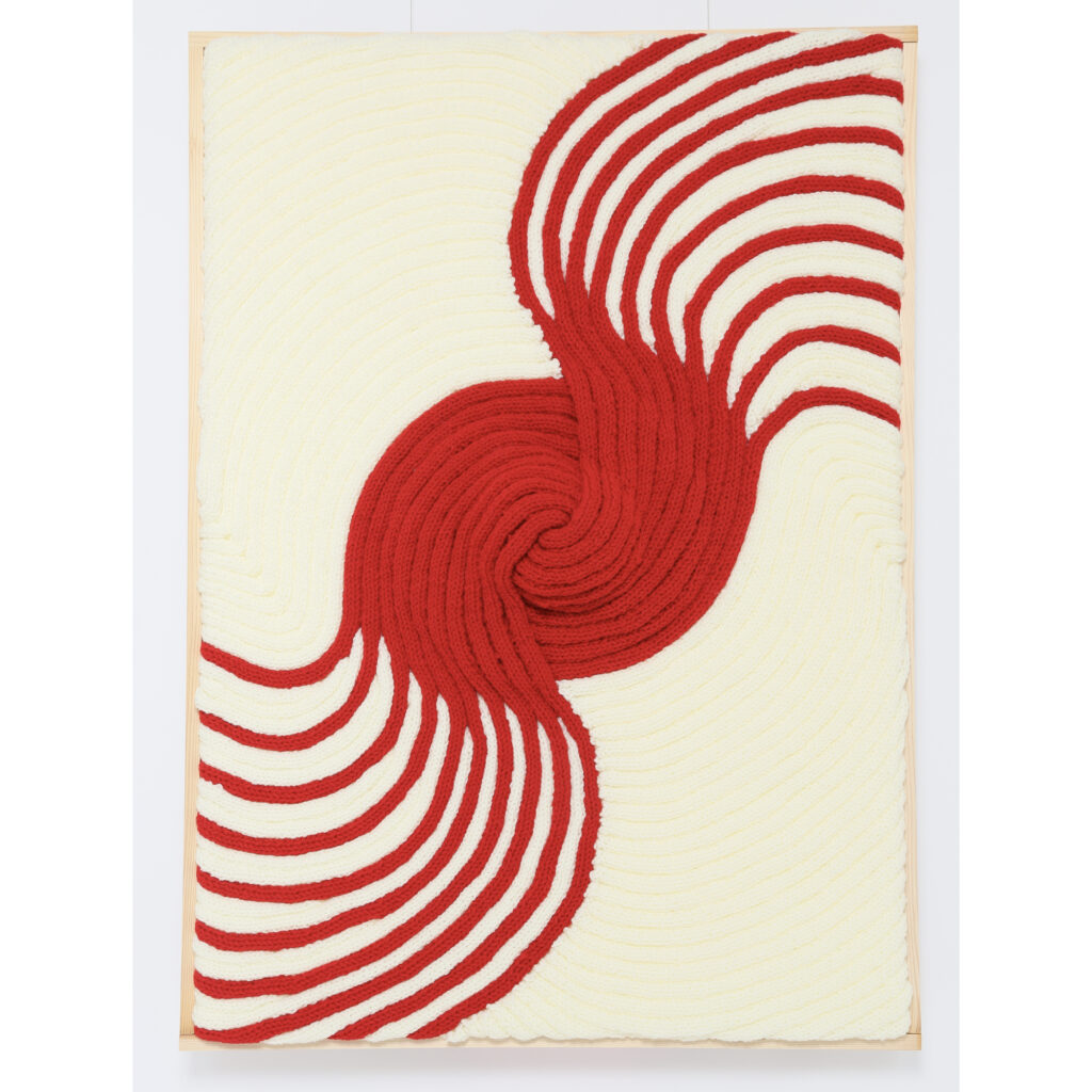
A torrential swirl of crimson. In contrast to the red circle, which flows up and down, the white curves toward the center and converges, representing stable integrity. In Western Europe, the circle has been regarded as God because of its perfect continuity. However, a Japanese person may recall the Rising Sun Flag or Hinomaru (National flag of Japan) in this work. As with other representations of the sun, the red and white colors represent hare (joy and prosperity), such as for an auspicious occasion or a prayer for reconstruction and the like. This work has been inspired by a part of traditional Japanese culture known as Mizuhiki, which are stiff cords that are folded and tied into fantastic shapes and used to close envelopes or gifts. The red and white paper Mizuhiki cords that are used for gifts represent unsealing, removing evils and connecting people, giving this work a further auspicious atmosphere. This work displays more strength than “Celebration” (original).